OVERVIEW
From Gendered App To an Inclusive Experience
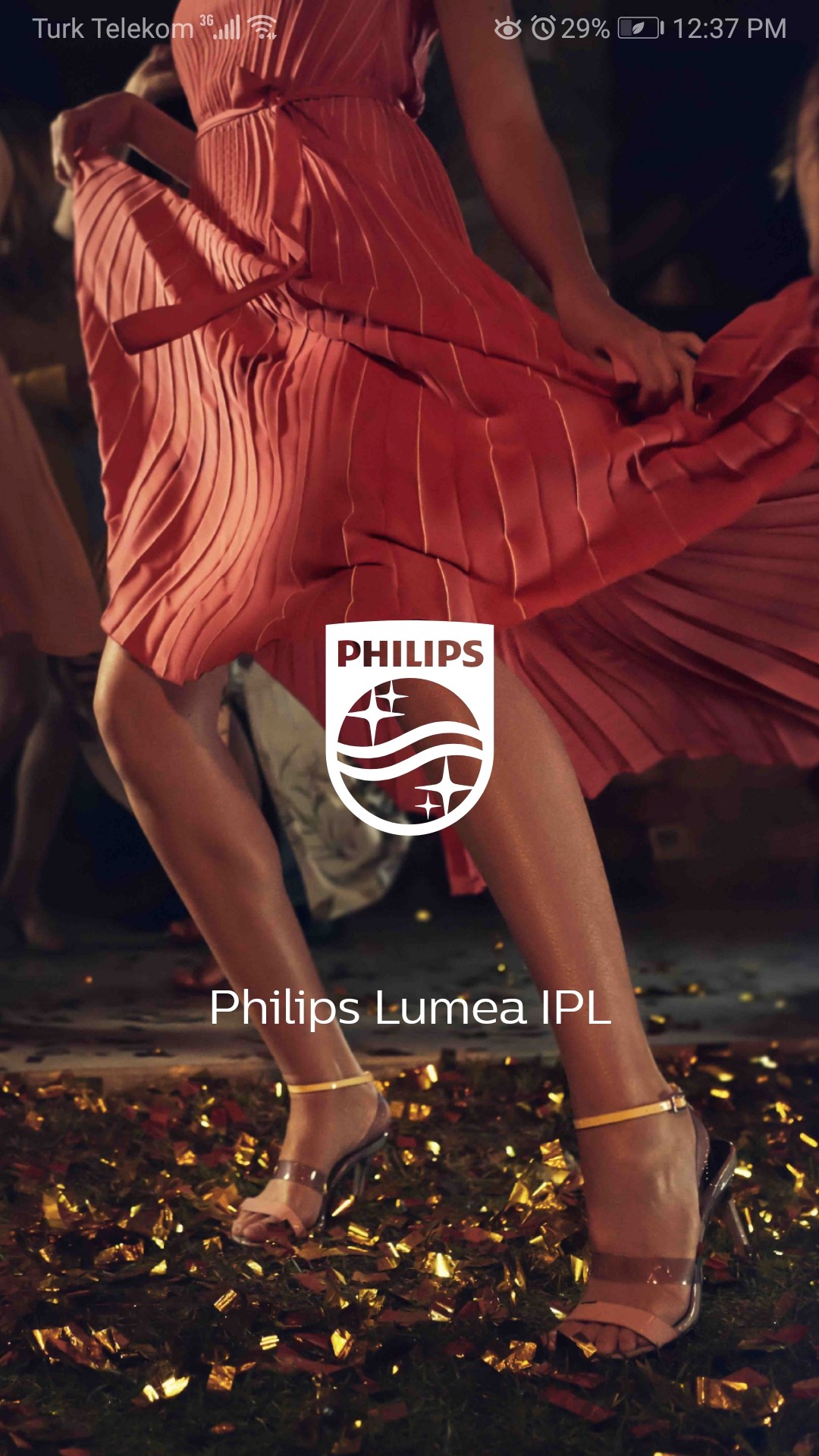
phılıps lumea
Redesign | Usability
As a user of the Philips Lumea IPL device, I found myself increasingly frustrated with the companion app. What should have been a simple tool for tracking epilation sessions had become a source of irritation.
One evening, the app's interface, awash in shades of pink and adorned with silhouettes of feminine figures, suddenly felt alien. That's when it hit me: the Lumea app wasn't just poorly designed - it was exclusionary! I saw this as an opportunity to improve user experience and inclusivity, and I decided to take on the challenge of redesigning the Lumea app from the ground up.
Year
Scope
Duration
2023
Complete redesign of flows, UI and usability improvements
3 weeks
WHAT WE GOT HERE
Uncovering the gender bias
As I delved deeper into the app's design, the evidence of gender bias became impossible to ignore:
Color Coding: The app was literally washed by the pink color. This wasn't just a aesthetic choice - it sent a clear message about who the app was designed for.
Iconography: Body part icons used throughout the app were distinctly feminine, leaving no room for diverse body types or genders.
Product Pages: Comparing pages for different Lumea models revealed a stark contrast. Models marketed to women were awash in pink, while the rare model for men was presented in blues and grays, reinforcing gender stereotypes.
Feminine body icons


“THE” CHALLENGE
How can I fix usability issues with gender-neutral focus?
This redesign’s challenge was not just about improving usability. It was about reimagining the entire user experience to be truly inclusive.
How could I transform the Lumea app from a gendered, cumbersome tool into an intuitive, welcoming experience for all users?
JOURNEY TO INCLUSIVITY
Redefining the user
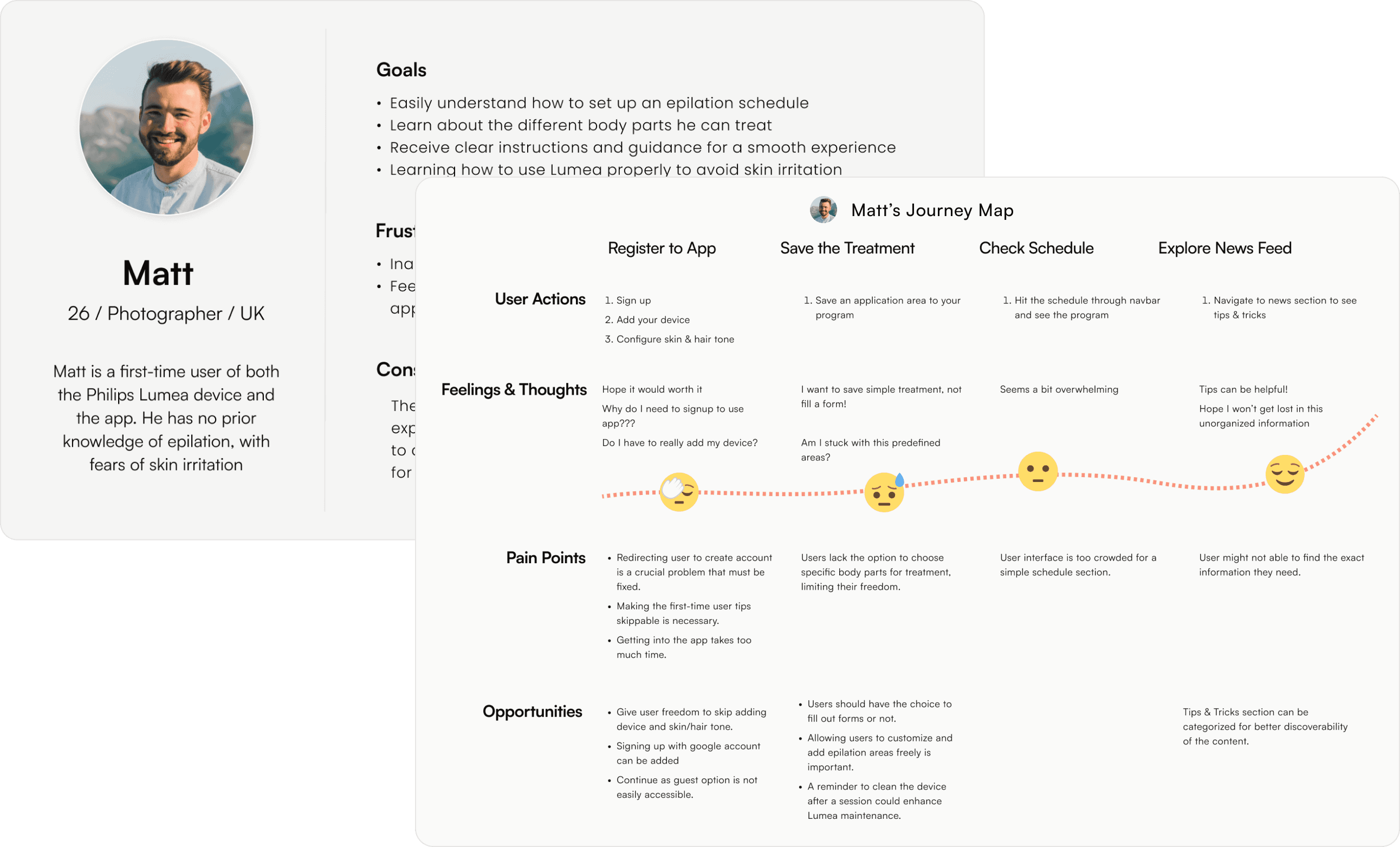
To break free from the app's current limitations, I created a persona that challenged our assumptions. Meet Matt: a first-time Lumea user with sensitive skin. By viewing the app through Matt's eyes, I uncovered pain points that went beyond gender:
The registration process was inflexible, forcing users to add a device and select skin/hair color immediately.
The treatment-saving process was tedious, with no option to skip or return to fields later.
The news feed, potentially valuable for new users like Matt, was disorganized and hard to navigate.
JOURNEY TO INCLUSIVITY
A Registration Roadblock
Before
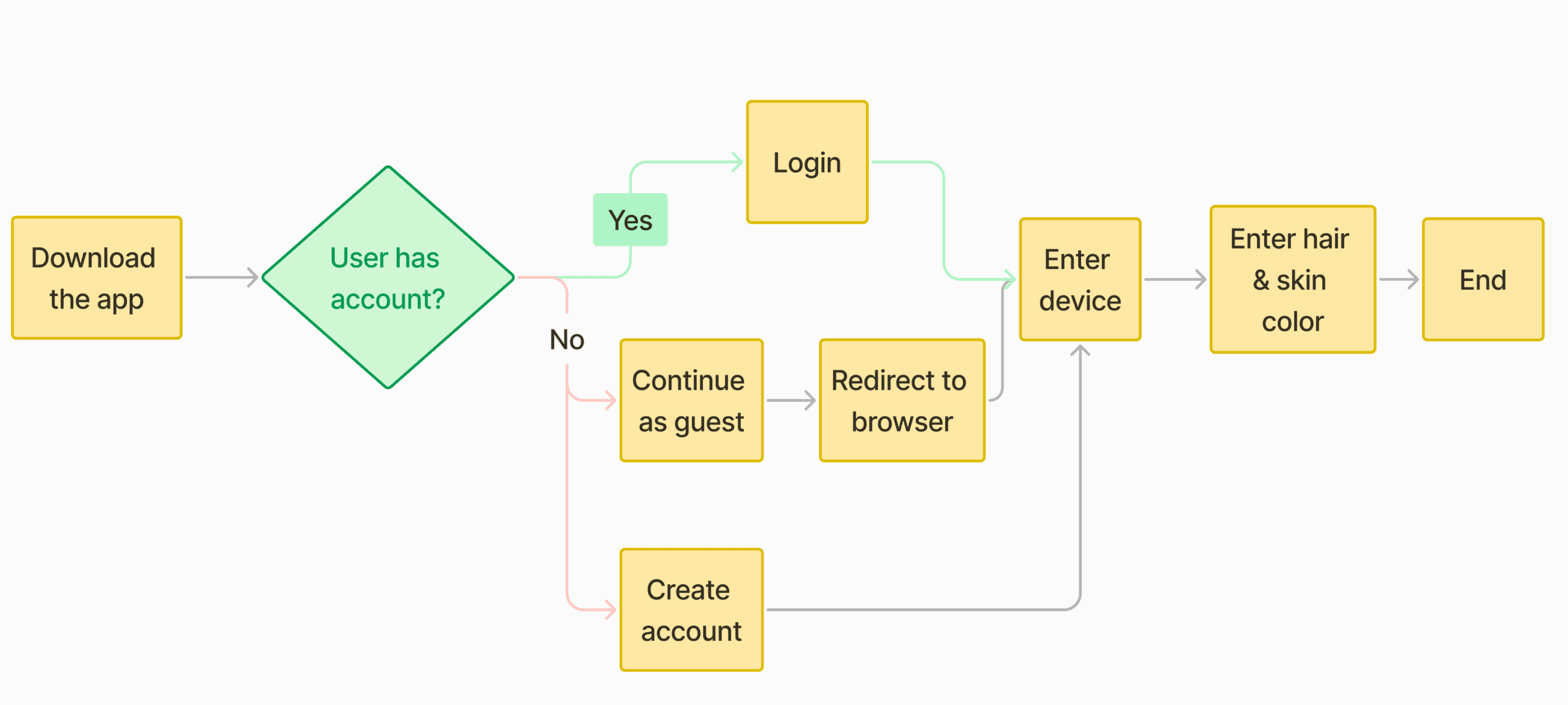
After

JOURNEY TO INCLUSIVITY
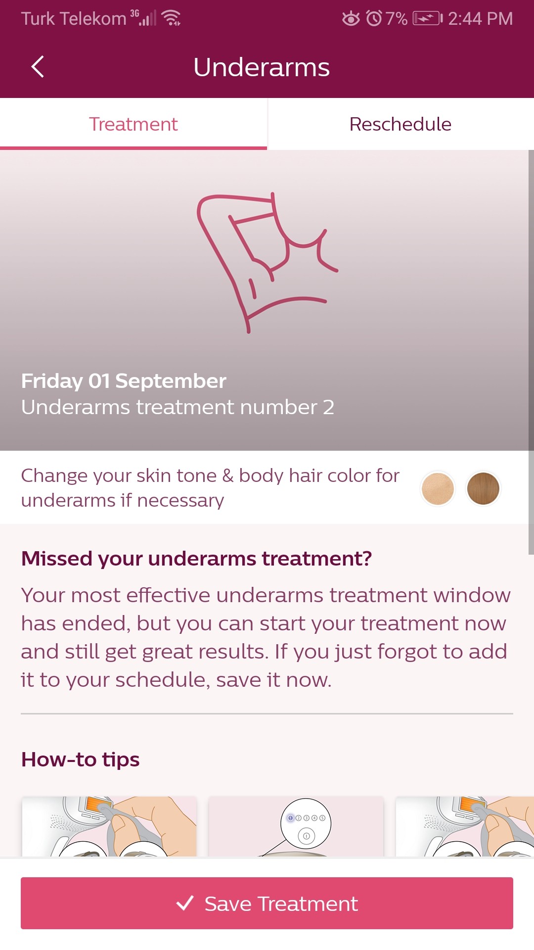
The Treatment-Saving Nightmare
Imagine this: You've just finished an epilation session. You're relaxed, maybe a little tender, and ready to move on with your day. But wait! The app that's supposed to help you now demands you fill out a 5-step form just to log your treatment. Talk about killing the mood!
Problem: saving treatment took ages...
Users had to fill out 5 steps form to save the treatment.
1st iteration
My first iteration introduced a switch button to make the form optional. Users could save their treatment with one tap, or choose to fill out the form if they wanted.


Final solution: save in 1 second by swiping!
In my final solution, users can save their treatment in just one second by swiping! It's quick, intuitive, and respects the user's time and context.
JOURNEY TO INCLUSIVITY
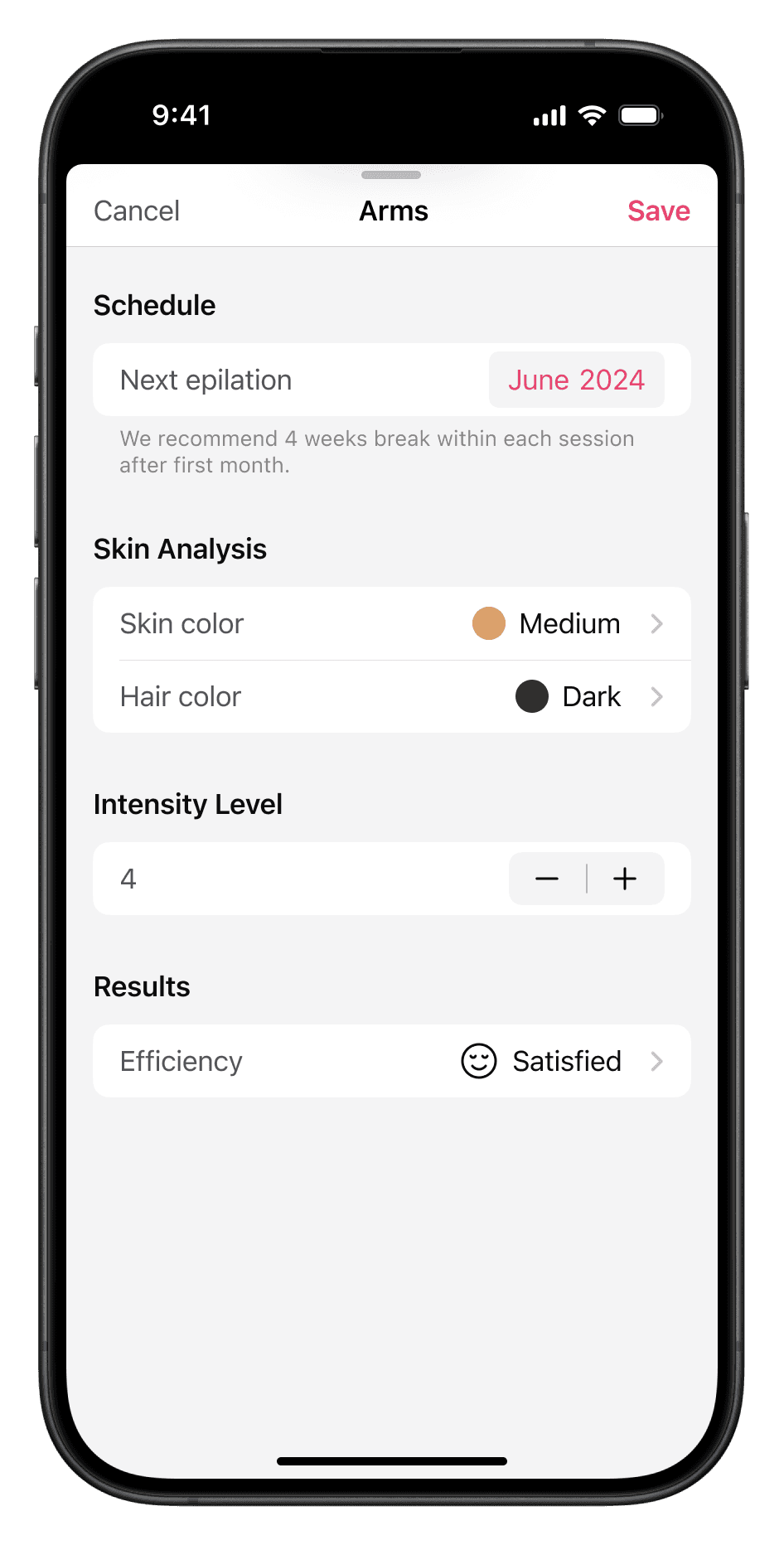
The Customization Conundrum
As I used the app more, I was shocked to find I couldn't customize my epilation areas. The app was limiting users to a predefined set of areas, ignoring the diversity of user needs and body types.
Users should add areas as they wish!
I introduced a feature allowing users to add custom areas. This wasn't just a nice-to-have feature; it was a crucial step towards true inclusivity. After all, every body is unique, and the app should reflect that.
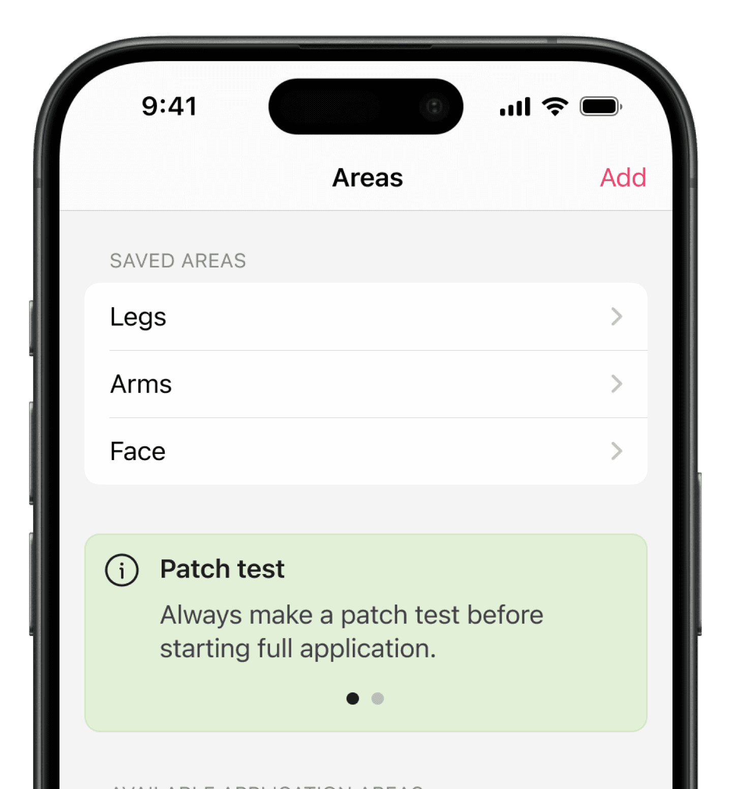
Add with one tap!


JOURNEY TO INCLUSIVITY
The Chaotic News Feed
The app's news feed was a jumble of product news, hair removal tips, and pre-epilation checklists. It was like trying to find a specific book in a library where all the shelves had been emptied onto the floor!
Unorganized feed
Tips were scattered everywhere—in the save treatment flow, the explore section, and more. This led to confusion and made it difficult to find the specific info needed.
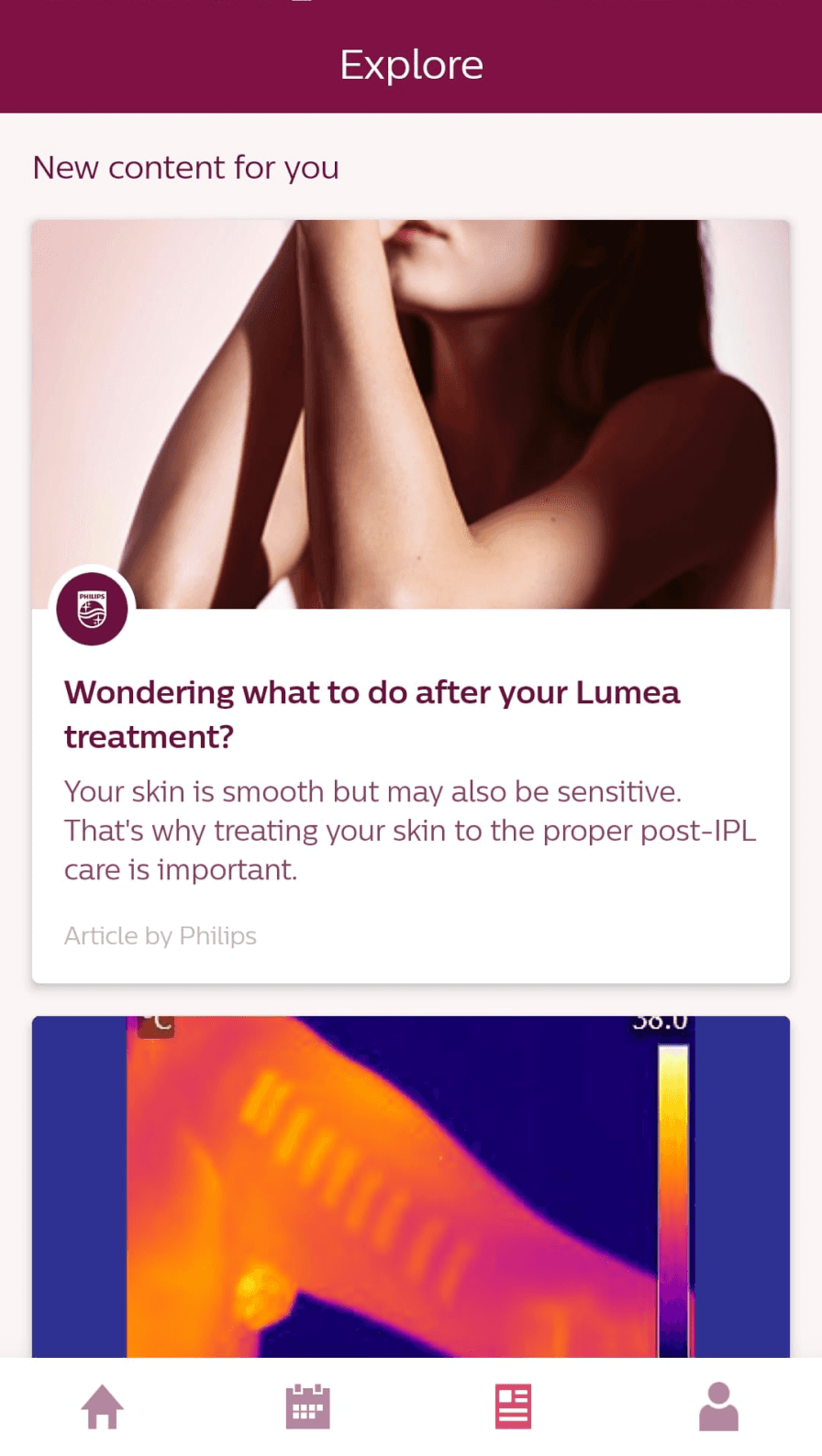
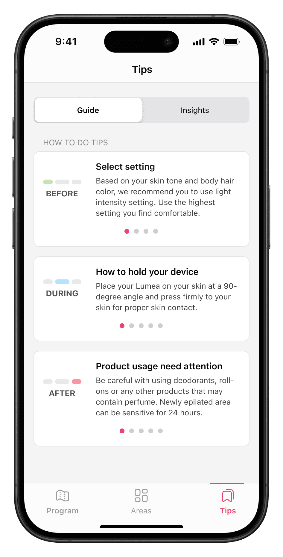
Tips & Guides have their dedicated space now!
I restructured tips feed with clear categories, making it easier for users like Matt to find relevant information.

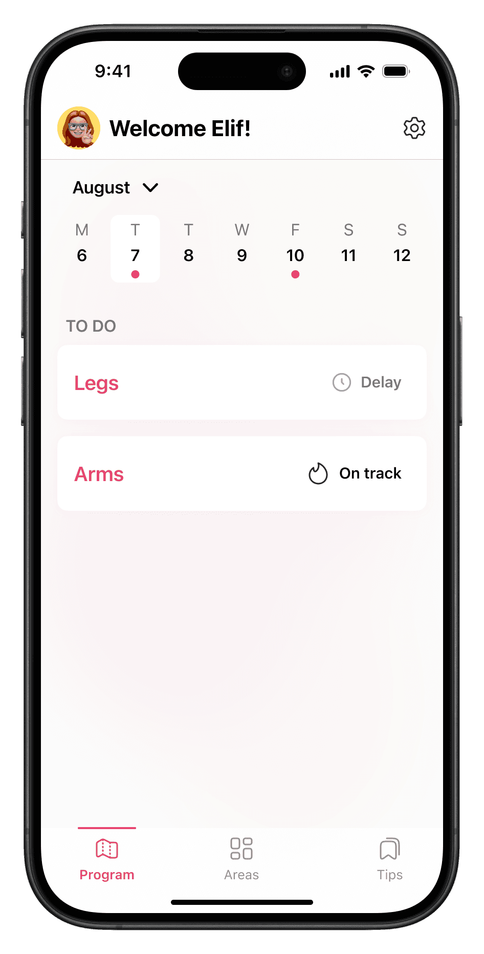
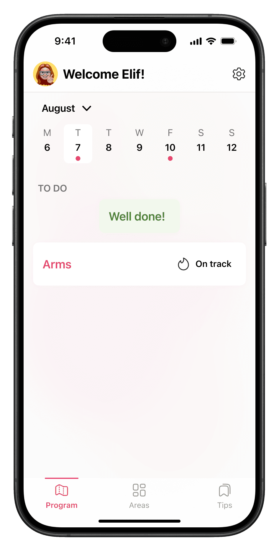
KEY SCREENS
Lumea is live
These are the key screens which turned Lumea into an inclusive experience, with 10x faster flows!


USABILITY TESTING
Validating the design
To ensure my design decisions were effective, I conducted a task-based usability test with five diverse participants.
Users were able to sign up 62% faster than before. What used to take over 2.5 minutes now takes less than 1.
But the most astounding improvement was in the treatment-saving process.
Previously, users would spend over 3 minutes on this task. After the redesign, it now takes just 3 seconds. Yes, that’s right—10 times faster!
And it wasn’t just about speed. Users from all gender groups expressed higher satisfaction and reduced frustration.

THE RESULT
The inclusive transformation
These changes weren't just about improving usability. They were about creating an app that respects and welcomes all users, regardless of gender identity or body type. By addressing both the usability issues and the deeper problems of representation, now the app can truly serve all its users.
Key improvements included:
A gender-neutral interface that welcomes all users
A streamlined treatment-saving process that respects users' time
Flexible options that accommodate diverse user needs and preferences
An organized news feed that provides real value to users of all experience levels
This project taught me the importance of looking beyond surface-level issues to consider the broader implications of design decisions. It showed me how seemingly small choices - like color palettes or iconography - can have a significant impact on user experience and inclusivity.
